Creature Comforts joined up with friends Run the Jewels on a collaborative IPA. Stay G-O-L-D is a hazy, juicy, and dank IPA featuring Citra, Mosaic, Strata, and Chinook hops. Stay G-O-L-D can designed by Young Athenians.

Creature Comforts joined up with friends Run the Jewels on a collaborative IPA. Stay G-O-L-D is a hazy, juicy, and dank IPA featuring Citra, Mosaic, Strata, and Chinook hops. Stay G-O-L-D can designed by Young Athenians.
Oconee Brewing Co reached out to us to design their craft beer labels and website. We developed a double sided can layout as well as type system that provided for an illustration highlight between the dual titles. This can template has lead to some of the illustration best work our studio has ever put out. We also built a website that is easy for the brewers to keep updated.
Visit the site: www.oconeebrewingco.com
The third beer Young Athenians designed for Oconee Brewing Co. THREE ONE THOUSAND® has a balanced malt and hop bitterness on the front end and heat on the back end. Hence the name 3, 1000. It’s a count down until a light habanero and strawberry spice heats up your palate. Since this is a relatively unique addition to the IPA market, we created a high caution meteoric pepper illustration that we feel conveys the heat on this IPA.
Dirt is a fast-farm-to-table restaurant in SoBe, Miami, on a mission to deliver innovative, delicious, healthy cuisine with excellent hospitality in a clean, uplifting environment that everyone can enjoy. With an outlook that positive, health-centric and community driven, Young Athenians was eager to get involved, creating content, a fully-responsive menu and graphic design that aligns not only with dirt's philosophy, but also with their fresh take on healthy, affordable cuisine for all.
Visit the site : https://dirteatclean.com
"Zero Calories, Zero sugar, Zero regrets” rings the slogan for Somerset Sparkling an Austin, Texas based sparkling water founded by mixologist two brothers. Somerset aims to provide active, health-conscious, working professionals, youngsters, and college-aged consumers with delicious sparkling waters that are not only refreshing, but also reinvigorating! Reach past soda and grab the sparkling water that uplifts. Somerset is naturally flavored and lightly caffeinated sparkling water.
Logo Design, naming, and package design with a bit of copy writing were supplied to the guys at Somerset. Watercolor was employed to create a visual visceral simulacra inference of water tinted with flavor.
Julian & Elsa called on us to collaborate on an identity, packaging, and a subscription driven eCommerce site. We were inspired by Elsa’s fascinating insight and educational chatter about the origins of medicinal herbs. In honor of that inherited knowledge we created PALO NUTRITION™ , a complete line of nutrition products complete with copy and a branded shopify site. We illustrated each herb that is a main ingredient to help spread the ancient knowledge of botanical healing and to hint at an herbalist’s journal.
Visit the site: https://palonutrition.com/
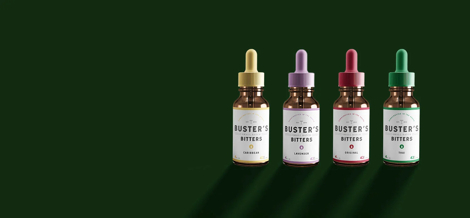
Buster's Bitters offers "a drop of distinction"
We were presented with a fun market challenge. No one has yet tackled and really nailed the bartenders secret ingredient... AROMATIC BITTERS. A local mixologist from one of our favorite farm to table restaurants approached us with the task of transforming his homemade bitters into a real market offering. The result was Buster's Bitters.
Buster's Bitters was a top to bottom brand delivery. We were presented with a delicious ingredient that packed maximum punch but had no identity, message or focus. We delivered a brand first label design to help this grass roots aromatic bitters brand grow from one product offering to four. We helped create the name, based on the client's bff/dog "Buster" and coined the phrase "a drop of distinction" to use as a tag line. We created recipes to go on the side of the bottles and wrote all of the copy to suit adventurous appetites.
Farm Burger locations are spreading through out the south east. We were part of the Farm Burger family before there even was a Farm Burger, designing the site for Farm255, the restaurant that started it all. Young Athenians sat in on early brand meetings with the Farm team to determine how a burger joint could be different, educational, and community activated? When Farm Burger struck out as its own entity we were right there to make its own distinct website and type system. We helped FB chose the colors, interior decor, think of diy print alternatives, and designed all of the in-store graphics templates.
Visit the site: https://farmburger.com
Total Cleanse wanted a retail identity after we completed the Total Cleanse project. They wanted something good so we gave them GÜD: TO GO.
A juice entrepreneur from Toronto reached out to us to create a brand identity for a juice cleanse product line. We were happy to help. Our team created the name Total Cleanse™, the tag line Clever & Clean™, and the packing for the juice line.
When Southern California's first dedicated treadmill studio need a visually competitive edge. We delivered a web site and typography system that enhanced their logo and elevated their look. We built a digital HQ with scheduling, class calendars, gym memberships, blog, and merchandise all under one roof.
Young Athenians is helping to birth another rockstar brand in Athens, Georgia; this time with a farm-to-table craft soda.
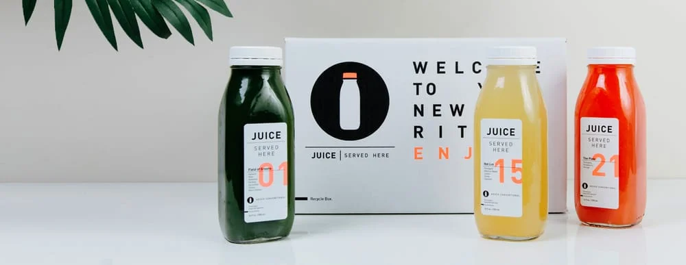
The hottest fleet of juice bars in Los Angeles needed a hot brand. From the retail design, to the packaging and the website, nothing about Juice Served Here has been conventional. We were very happy to help birth this highly successful brand.
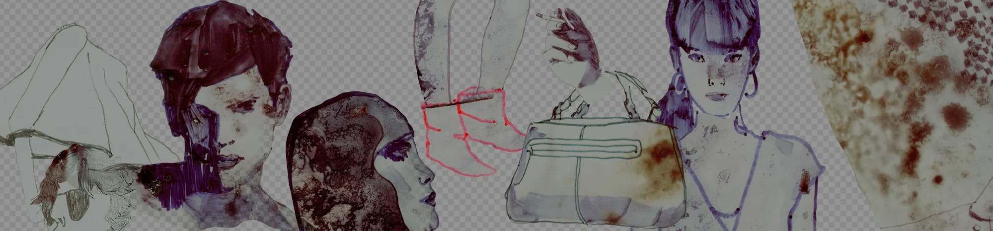
Focus on the image. RWFA (Rick Wester Fine Art) is a premiere art services company specializing in artist representation and consulting to private collectors and corporations. When they approached us to rethink their website, we saw it as an opportunity to create an elegant visual forum.
Carol John is an artist and designer living in Athens, Georgia. John's work expresses her love of color, language, and pop graphics. It was the task of Young Athenians to translate her work into an easy, uncomplicated portfolio site.
Busy managing the public relations for the entertainment industry's most glamorous and talented, Fifteen Minutes needed Young Athenians to come in glitz up its web image. Now we are ready for our close up too.
The modern day equivalent to space camp. Start:Code teaches kids computer programming in a flexible environment that combines class and lab time with coaching and mentoring. Young Athenians was able to help develop the whole brand along with the site.
Through years of antiquing in Europe, Holland&Company has gained an in-depth knowledge of period furnishings and an eye for great design. Those at H&C came to us for a design that would retain the Old World style of the brand for a contemporary Internet presence.
Fi³ is an LA-based INFLUENCER forum that puts a new spin on what a trade show can be. Its innovative mission jived well with who we are and we were happy to provide the web end of its forum.